You open your bead container, and reality hits: you have red, blue, yellow, green, black, and white—maybe a few others. The pattern you want calls for fifteen shades. Before you give up or order more beads, know that a limited palette can be a creative advantage. Many classic pixel art and retro designs rely on just a handful of colors. With a little planning, you can turn your stash into satisfying fuse bead projects with limited colors.
Start by Sorting and Auditing Your Beads
Before you design anything, get a clear picture of what you actually own. Dump all your beads onto a tray or mat and separate them by color. Group similar shades together—for example, all your blues, from light to dark. This step does two things: it shows you exactly which colors you have plenty of, and it reveals which ones are nearly gone.
Count or estimate quantities. If you have 200 black beads but only 20 white, you know to design with black as a dominant color. Write down your inventory on a sticky note or in your phone. This simple list becomes your palette.
While sorting, check bead condition. Broken or misshapen beads can ruin a project, so toss them. If you need to restock a specific color, look for reliable suppliers that offer individual color bags, such as matching supplies at Fusedots, so you can fill gaps without buying a whole new set.
Work With Color Theory Instead of Against It
A limited palette doesn’t mean boring. It means you need to be intentional about contrast and harmony. Here are three approaches that work well with few colors:
- Monochromatic plus one accent: Use shades of a single color (light blue, medium blue, dark blue) and add one contrasting color for pop. If you only have one blue, use black and white to create shading.
- Complementary pairs: Pick two colors opposite each other on the color wheel, like blue and orange or red and green. They create strong visual tension and make simple designs look deliberate.
- Warm vs. cool: Group warm colors (red, orange, yellow) against cool ones (blue, green, purple). Even with four or five colors, this split adds depth.
Remember that fuse beads are viewed from a distance. Subtle shade differences often disappear after ironing. Rely on value—light versus dark—more than exact hue. A dark red and a dark brown may look nearly identical in a finished piece.
If you want to explore palette ideas further, a color palette guide can help you choose combinations that work with what you have. See this collection of palettes for inspiration.
Adapt Patterns to Your Available Colors
Most fuse bead patterns are just grids of colored squares. You can swap any color for another as long as you maintain contrast. Here’s a step-by-step method:
- Print or open the pattern on your device.
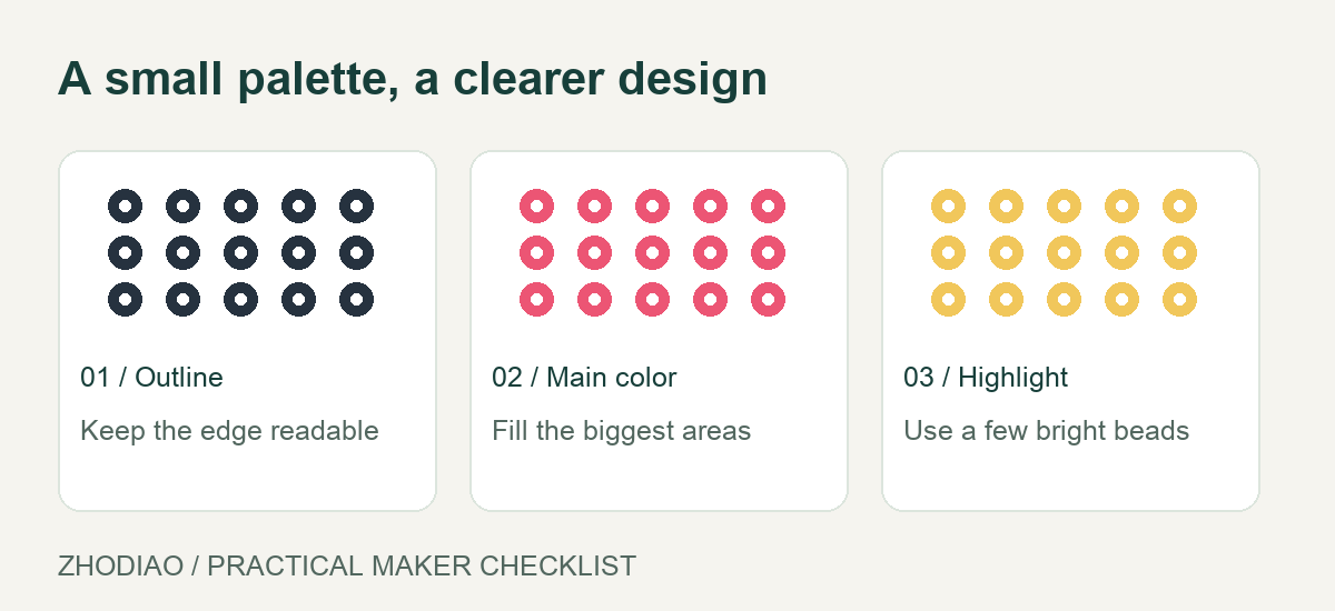
- Identify the main color areas (background, outlines, highlights).
- Assign your available colors to those areas based on value. For example, if the pattern uses light gray for highlights, use white; if it uses dark gray, use black.
- Check the outline. Outlines are usually black, but if you’re low on black, use a dark version of your main color.
- Test a small section first. Iron a tiny sample to see how the substituted colors look together.
This method works for almost any pattern. You can also simplify complex patterns by reducing the number of colors. Fewer colors often make the design look cleaner and more graphic.
For free patterns that are easy to adapt, browse these free fuse bead patterns. Many are designed with small palettes in mind.
Design Your Own Projects Around Your Palette
When you design from scratch, you control the color count. Start with a simple shape or pixel art character. Use graph paper or a free online pixel editor. Set a limit: no more than four or five colors.
Here are project ideas that shine with few colors:
- Retro video game sprites: Classic 8-bit characters often use three or four colors. Perfect for a limited stash.
- Geometric coasters: Repeating triangles or hexagons in two or three colors look modern and intentional.
- Mandalas: Use one background color and one or two accent colors. The symmetry does the work.
- Initials or simple icons: A single letter in a contrasting color on a solid background is striking.
If you’re new to designing, a beginner’s guide can walk you through the basics of pixel art and bead placement. Check out this beginner guide for step-by-step help.
Keep a sketchbook of ideas that match your current bead inventory. When you run out of a color, you can adjust the sketch instead of abandoning it.
Make the Most of Neutrals and Metallics
Black, white, gray, and clear beads are your secret weapons. They act as shading, highlights, and outlines. If you’re low on colored beads, increase your use of neutrals. A design in black, white, and one bright color can be more striking than a rainbow.
Metallic or glitter beads can also stretch a palette. A single metallic bead used as an accent can replace a whole shade. Use them sparingly—they draw the eye.
When you do buy more beads, prioritize neutrals and a few core colors. They mix well with everything. For individual color bags and bulk options, matching supplies at Fusedots is a practical place to start, especially if you only need to top up a few colors.
Ironing and Finishing With Fewer Colors
Ironing can change how colors appear. Beads melt and become slightly translucent, so dark colors may lighten and light colors may pick up neighboring hues. Always test iron a small sample before committing to a full project.
Use a consistent ironing technique: medium heat, circular motion, and even pressure. Over-ironing can muddy colors and blur the distinction between similar shades. If your palette is tight, aim for a flat, fully fused look rather than a textured one—it keeps the design readable.
After ironing, place a heavy book on the project while it cools to prevent warping. This is especially important for large pieces made with few colors, where any distortion is more noticeable.
Conclusion
A limited bead collection is not a roadblock—it’s a chance to be more creative. By auditing your inventory, using color theory, adapting patterns, and designing around your palette, you can make fuse bead projects with limited colors that look intentional and polished. Remember to test iron, lean on neutrals, and keep a wish list for future restocks. Your next project might be your best one yet, and it won’t require a single new bead.