Turning a favorite photo into a fuse bead project can go one of two ways. Either you end up with a clear, charming design that matches the picture, or you get an unreadable blob of beads and a lot of second-guessing. The difference usually isn’t artistic talent. It’s planning.
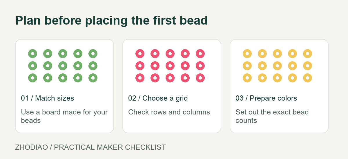
Fuse beads work on a fixed grid, so a photo has to be translated rather than copied. This guide walks through a practical process for planning a simple fuse bead pattern from a photo, from choosing the right image to checking the layout before you iron anything.
Start With a Photo That Suits the Grid
Not every photo converts well. Fuse bead patterns are built from small, square units, so images with strong shapes and clear contrast translate best. Before you commit to a picture, ask a few questions.
- Is there one clear subject? A pet’s face, a single flower, a logo, or a simple object works better than a crowded group shot.
- Does the subject fill the frame? If your subject is tiny in the corner, you’ll spend most of your beads on background.
- Is the lighting even? Harsh shadows can create confusing dark patches on a grid. Soft, even light is easier to interpret.
- Are the colors distinct? Two similar shades may collapse into one bead color once the grid gets small.
Portraits of animals, simple icons, flowers, and food shapes are reliable starting points. Busy landscapes and detailed architecture usually need far more beads than a beginner project allows.
Crop and Simplify Before You Count a Single Bead
The most common mistake is trying to include too much of the photo. Cropping is not cheating; it’s the main design decision. Decide what the pattern is actually about, then remove everything that doesn’t support it.
Choose your crop deliberately
Zoom in until the subject fills most of the frame, leaving only enough space to keep the shape readable. For a pet portrait, crop tightly around the head and ears. For a flower, crop to the bloom rather than the whole stem and garden.
Reduce the detail to shapes
Look at your cropped image and identify the big shapes: the outline of a head, the dark centers of eyes, a patch of shadow. If you can’t describe the subject in a handful of shapes, simplify further. This step saves you from a pattern where every bead is a different color and the result looks muddy.
Pick a bead count you can finish
Decide on a pegboard size before you design. A small square board is forgiving for a first attempt; larger boards give you more detail but demand more time, more beads, and more careful counting. If you’re new to the craft, review a beginner guide to understand typical board sizes and bead counts before choosing your dimensions.
Map the Photo onto a Grid
Once the photo is cropped and simplified, translate it into a grid. You don’t need special software, though a basic image editor with a grid overlay helps.
- Set your grid size. Match the grid to your pegboard, for example 14 by 14 or 29 by 29 squares. Keep the aspect ratio of your crop close to the board’s shape so the subject isn’t stretched.
- Overlay the grid. Place a square grid over the cropped image so each cell represents one bead position. If you’re working by hand, print the photo and draw the grid with a ruler.
- Read each cell. For every square, note the dominant color. Don’t agonize over tiny variations; choose the closest match from your bead palette.
- Sketch the outline first. Before filling in color, mark the outer edge of the subject. A clear silhouette is what makes a fuse bead pattern recognizable.
Working on paper first is worth the extra ten minutes. You can erase, adjust, and reconsider without melting anything.
Build a Small, Workable Color Palette
Photos contain thousands of colors; bead palettes don’t. Limiting your colors is not a compromise, it’s what makes the pattern readable.
Aim for roughly four to eight colors for a small project, including one light shade and one dark shade for contrast. Group similar tones: instead of three different browns, use one mid-brown and one dark brown. If you’re unsure which shades work together, a color palette reference can help you choose combinations that read clearly at bead size.
Test the palette on a small section
Before committing to the full pattern, lay out beads for just the eyes or the center of the flower. Small areas reveal whether your light and dark shades create enough contrast. If two colors look nearly identical on the board, swap one out.
Do a Dry Run Before You Fuse
Lay the beads out on the pegboard without ironing. Step back and look at the design from a short distance, because that’s how others will see it. Common problems show up clearly at this stage:
- Lost features. Eyes or mouths may disappear if they’re only one bead wide. Widen key features by a bead where possible.
- Muddy areas. If a section looks flat, add a lighter or darker bead to create separation.
- Unbalanced edges. Check that the outline is even on both sides so the subject doesn’t lean.
Take a photo of the dry layout on your phone. Seeing it on a screen often makes errors more obvious than staring at the board. Adjust the layout before you apply heat, since fusing is the one step you can’t easily undo.
Keep a Simple Pattern Record
Once the layout works, record it. Either photograph the board clearly or sketch the grid on paper with color notes. A saved pattern lets you remake the design, scale it up later, or share it with someone else. Keeping a small notebook of finished patterns is also a useful way to track which color combinations worked and which ones didn’t.
If you want ready-made designs to practice the grid-reading skill, browsing free patterns gives you examples of how simple shapes translate into beads. Studying a few finished patterns makes it easier to spot which details matter in your own photo.
Conclusion
Planning a fuse bead pattern from a photo is mostly a series of small, sensible decisions: pick a photo with one clear subject, crop tightly, simplify the shapes, map everything to a grid, and limit your colors. Then test the layout on the pegboard before any heat is involved.
The process rewards patience. A pattern that looks slightly plain on paper often looks crisp and charming once fused, while an over-detailed design tends to lose its subject. Start small, keep your palette tight, and treat the first few attempts as practice. Each project makes the next photo easier to read.