A school mascot fuse bead design looks simple on paper: pick the school colors, fill in the shape, iron it, done. In practice, the colors are where most projects succeed or fall apart. A tiger that should look fierce can turn into an orange blob, and a navy-and-gold crest can lose its gold trim the moment the beads melt together. Planning fuse bead colors for a school mascot design means thinking about more than the two or three colors on the school flag. You need to account for shading, outlines, contrast, bead availability, and how the finished piece will be viewed.
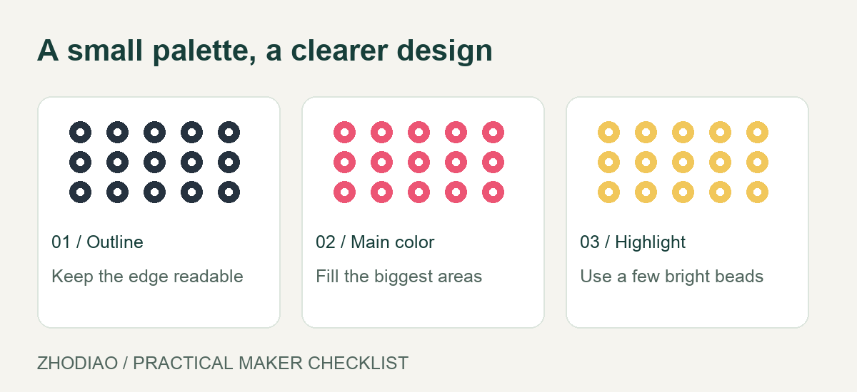
This guide walks through a repeatable color plan you can use for a mascot on a pegboard, a keychain, or a larger display piece.
Start With the Official Colors, Then Widen the Palette
Begin with the school’s official colors, but treat them as anchors rather than the whole palette. Most mascot designs need at least three versions of each main color: a light tint for highlights, a mid tone for the main body, and a dark shade for shadows and edges.
For example, if your mascot is a bulldog in royal blue and white, your working palette might include:
- Royal blue for the main body or jersey
- Light blue or sky blue for highlights on a curved shoulder
- Dark navy for folds, under the chin, and the outer outline
- White for the chest, eyes, and trim
- Light gray for shading on white areas so they do not look flat
- Black or dark gray for pupils, nose, and fine outlines
This wider palette gives the mascot dimension. A flat royal-blue shape reads as a silhouette; a blue shape with a navy shadow and a light-blue highlight reads as a character. If you are new to building palettes, browsing color palette references can help you see how tints and shades work together before you commit beads to a board.
Match the Mascot’s Features to the Right Bead Colors
Not every part of a mascot needs the school colors. Eyes, noses, and accents often carry the design. Plan these separately so the school colors do not overwhelm the face.
Eyes and facial features
Use white for the eye base and a dark color for the pupil. If the mascot has a friendly expression, a dark brown or charcoal pupil can look softer than pure black. Add a single light bead as a catchlight if the design is large enough to support it.
Outlines and edges
A dark outline helps a mascot stand out on a light background, but it can also make the design look heavy. Decide early whether you want a full outline, a partial outline along the bottom and sides, or no outline at all. If the mascot will sit on a white shirt or a pale wall, a dark outline is usually the safer choice.
Accents and props
School mascots often hold something: a torch, a ball, a book, a flag. Give these props their own small color set, and keep them distinct from the body. A gold torch against an orange uniform will disappear, so shift the prop toward yellow or add a dark handle to separate it.
Test Contrast Before You Fill the Pegboard
Contrast is the most common source of disappointment in fuse bead mascots. Two colors that look different in a bag can look identical once melted, especially when they sit side by side.
Before you bead the full design, make a small test patch: a 5-by-5 square using your main color pairs. Iron it the way you plan to iron the final piece, then look at it from a few feet away. Ask three questions:
- Can I tell the body color from the shadow color?
- Does the outline separate the mascot from the background?
- Do the facial features still read at a distance?
If the answer to any is no, swap one color for a lighter or darker version. This step takes a few minutes and saves you from redoing an entire mascot. If you need to confirm bead sizes and tools before testing, the materials and tools guide covers the basics.
Build a Color Map and a Bead Count
Once the palette is set, sketch the design on paper or use a grid template, then label each region with a color name. This color map becomes your shopping and sorting list.
Count beads by color, not by total. A mascot with a large body may need several hundred beads of one mid tone, while the outline might need only sixty dark beads. Grouping your counts helps you spot shortfalls before you start. It also tells you which colors are worth buying in a larger container and which you can pull from a mixed set.
Sort the beads into small cups or trays in the order you will place them: outline first, then large body areas, then details. Working in that order keeps you from accidentally filling a detail area with the wrong color. For more pattern-planning habits, beginner guides offer useful groundwork.
Avoid Common Mascot Color Mistakes
- Using only the school’s two colors. Add tints, shades, and a neutral so the design has depth.
- Forgetting the background. A white mascot on a white display board needs an outline or a colored backing.
- Choosing colors by name instead of by eye. Compare beads side by side in daylight, not under warm indoor lighting.
- Ignoring the melt. Some colors shift slightly when ironed. Test before committing.
- Overloading details. Tiny color changes can turn to mush at small sizes. Simplify for keychains and small boards.
If you are building a mascot for a fundraiser or a classroom project, a fuse bead color selection can help you gather the shades you need without buying full mixed sets.
Final Check: View the Design as a Whole
Before ironing, step back from the pegboard and look at the mascot from arm’s length and from across the room. Check that the school colors dominate, the face reads clearly, and the outline does the job you intended. A quick photo on your phone can reveal contrast problems you miss up close.
Planning fuse bead colors for a school mascot design is really a small design exercise: choose anchors, add tints and shades, test contrast, and map your counts. Do that work before the first bead goes down, and the finished mascot will look intentional, recognizable, and true to your school.