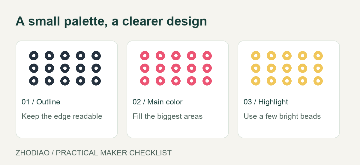
Outlines are one of the fastest ways to make a fuse bead design read clearly. A dark border around a character, a black rim around a shape, a thin line separating two similar colors — these small decisions can turn a muddy sprite into something sharp and intentional.
They can also ruin a project. A heavy outline flattens shading, hides carefully chosen colors, and makes every design look like a sticker from the same template. The problem is not outlines themselves. It is using them by default instead of by decision.
This guide covers when an outline helps, how thick it should be, which colors work, and how to tell when your design is better off without one. The goal is simple: outlines that support your design, not outlines that become the design.
What an Outline Actually Does to a Fuse Bead Design
Before choosing a border color, it helps to know what a border is doing visually. In fuse bead work, an outline usually does one of three jobs:
- Separation: It keeps two adjacent colors from blending when they sit next to each other, especially after melting softens the edges.
- Definition: It tells the eye where a shape ends, which matters most for small or complex designs.
- Style: It creates a deliberate look — cartoonish, pixel-art, stained glass, or graphic.
Any one of these is a good reason to add a line. If your outline is not doing at least one of them, it is probably just adding weight. That is the first test to apply before you start beading.
It also helps to remember that fuse beads already have a built-in grid. Each bead is a pixel with its own edge. On a small design, that grid provides some natural separation on its own, which is why tiny patterns often need less outlining than large ones.
Choose the Right Outline Color, Not Just Black
Black is the default, and it is often the wrong choice. Black is the darkest value on your board, so it pulls attention toward the border and away from the interior. On a bright, cheerful design, a black outline can make the whole piece feel heavy.
Better options depend on what the design needs:
- Dark version of the nearby color: A deep navy outline around blue, or dark green around light green, keeps the shape readable while staying in the same color family. This is usually the most harmonious choice.
- Warm dark brown or charcoal: Softer than pure black, and a good match for skin tones, animals, and natural subjects.
- Mid-tone gray: Useful when you want structure without a hard line, such as on metal, stone, or shadowed areas.
- Contrasting accent: A bright outline can work as a design feature, but treat it as a bold choice rather than a safe one.
If you are unsure, place two or three candidate outline beads along the edge of your design before committing. Looking at the actual beads next to your palette is far more reliable than guessing from a screen. A curated set of shades makes this easier; browsing a color range for fuse beads can help you find those in-between tones that make subtle outlines possible.
How Thick Should an Outline Be?
Thickness changes everything. A one-bead outline reads as a detail. A two- or three-bead outline reads as a frame. Neither is wrong, but they send different messages.
As a general rule:
- One bead: Best for small designs, detailed characters, and any pattern where interior space is limited. It defines without stealing room.
- Two beads: Suitable for medium designs that need a stronger graphic edge, such as logos, badges, or keychains meant to be seen from a distance.
- Three or more beads: This becomes a border rather than an outline. Use it only when the border is part of the concept, not when you simply want clarity.
Scale matters here. A one-bead outline on a 30-bead-wide design is proportionally thin. The same one-bead line on a 10-bead design is proportionally thick. Judge thickness relative to the size of the piece, not in absolute terms.
If you are making a small charm or keychain, a single-bead outline is almost always enough. Tools that help you place beads precisely and check spacing make this easier to control, and a basic set of fuse bead tools is worth having if you outline often.
When to Skip the Outline Entirely
Some designs are stronger without any border. Consider leaving the outline out when:
- The design uses shading. Gradients and soft transitions rely on colors touching each other. An outline around every shape breaks that flow and turns smooth shading into a patchwork.
- The silhouette is already clear. If the outer shape is distinct against the background, an outline adds nothing.
- You are working with a limited palette. Spending beads on borders reduces the colors available for the subject itself.
- The design is intentionally soft. Flowers, clouds, and abstract patterns often look better with edges that dissolve rather than edges that announce themselves.
A useful compromise is a partial outline: define only the features that need it, such as the eyes, the main contour, or the boundary between two similar colors. Leaving the rest open keeps the design breathing. You can see how varied this approach looks across different styles in a collection of free fuse bead patterns, where some designs use full borders and others rely on color alone.
A Practical Workflow for Outlining
If you want a repeatable process, try this order:
- Build the interior first. Lay out the main colors and shading before adding any border. You will see whether separation is actually needed.
- Step back and squint. If shapes blur together, mark those specific boundaries. Do not outline everything by reflex.
- Test the outline color in place. Add a short section of the border and check it against the interior colors.
- Choose the thinnest line that solves the problem. Start with one bead and only go thicker if the design still reads poorly.
- Check the outer edge separately. The border around the whole piece and the lines inside it are two different decisions. You may want one and not the other.
Working in this order prevents the most common mistake: outlining first, then discovering that the border dictates the whole palette.
Keeping Your Own Style in Charge
Outlines are a tool, not a rule. The best fuse bead designs use them where they add clarity or character, and leave them out where color and shape can speak for themselves. If you find yourself reaching for black by habit, that is a sign to pause and ask what the border is for.
Experiment on small pieces where the cost of a wrong choice is low. Try the same design twice, once with a dark outline and once without, and compare them side by side. Over time you will develop a feel for when a line sharpens a design and when it flattens it — and your work will look more deliberate because of it.